
Something was missing.
Although graphic designer and lifelong Seventh-day Adventist Mark Cook had established a successful graphic design business, serving major clients such as furniture manufacturer Herman Miller and working with talented employees and friends, over time, he felt a need for something more.
“From a design perspective, it was kind of everything that I hoped to have in a studio,” Cook says, “but it never went beyond just being design. And that was kind of okay to start with but, after a few years, I realized that I really wanted to have a studio that was doing more than just making beautiful things, and I wanted it in service of something bigger than that.”
In 2015, Cook, along with fellow Adventist designer, Ivan Ruiz-Knott, decided to establish a new studio where they could utilize their creative talents for their church.
“We started the studio simply with the goal of wanting to make really great Adventist experiences,” Cook says in explaining the genesis of Types & Symbols. “[Ivan and I] both came to a similar perspective of realizing that the message is great but, oftentimes, the packaging of that message could be a little bit better, a little bit more compelling. So, we had a strong desire to use design to help further the message of Adventism and hopefully present it in a little bit more of a compelling way.”
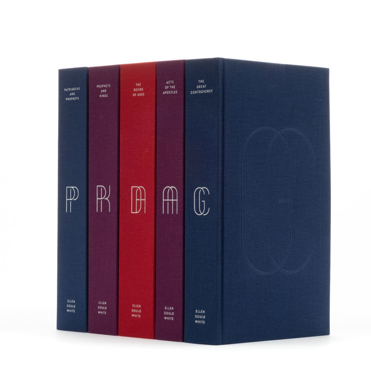
Once the new studio got up and running, Cook and his team were able to focus on a major project that had been laid on their hearts: a special redesign of Ellen White’s Conflict of the Ages series. The idea initially came to Cook when he and his wife were searching for a collection of these books for their home. “We just didn’t see anything out there that we really wanted to own,” he reflects. The couple finally found a nice enough vintage set, but the experience made Cook aware of a need. “Why isn’t there just a beautifully designed, super, well-crafted edition of these books that are referenced and read on such a regular basis?” he asked himself. Thus, the idea for “The Conflict Beautiful” was born. Cook and his team began working on their design.
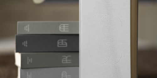
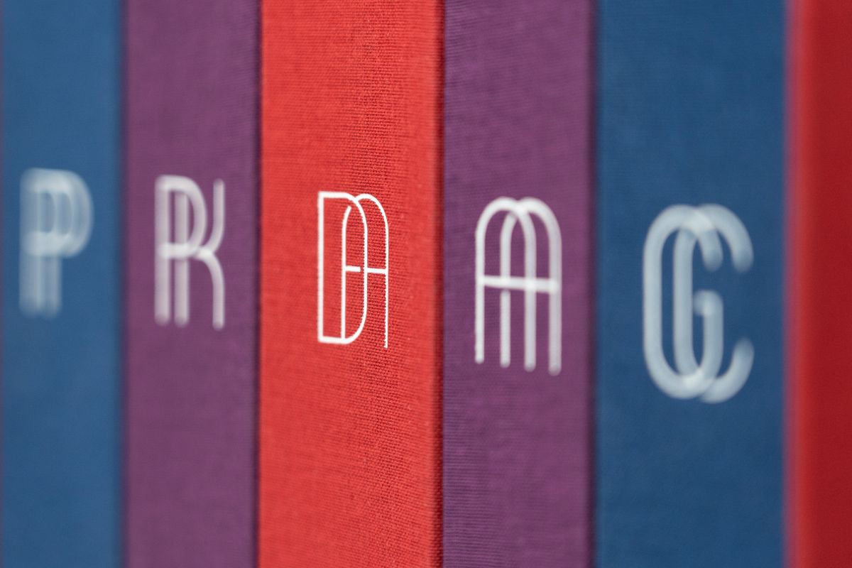
“We recognized pretty early on that the acronyms for the books — DA, GC, PP — were used quite a bit,” Cook says. The team decided to incorporate this into their cover design and looked to the Bible itself for the rest. “[We] went through a lot of different design variations around the monograms and ultimately ended up with an underlying grid for each monogram that’s based on the dimensions of the Sanctuary,” he explains enthusiastically. “Each letter fits within a 2-to-1 rectangle, which are the dimensions of the Outer Courtyard. And within the actual 2-to-1 rectangle, there’s a perfect square, 2 perfect squares, and also circles that fit in there, and those were pulled from the altar, which is a perfect square, the Most Holy Place perfect square, and the labor, which is that perfect circle.”
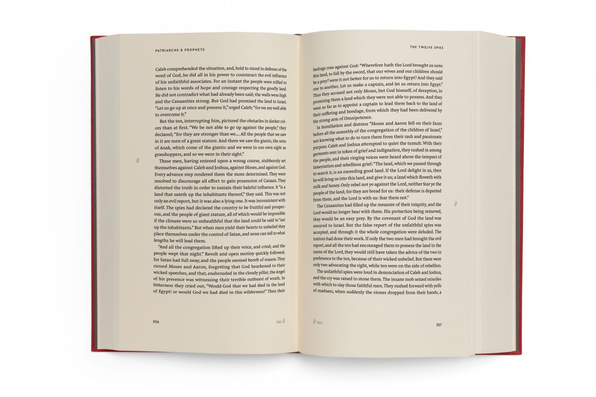
The goal for the book interior is optimum readability. The team chose to use book cloth and embossing on the cover, a binding where pages will never fall out, paper that is smooth with a heavier weight, and margins to accommodate comfortable reading, whether the book is held on the sides or underneath. “There’s also a really subtle reference again to the Sanctuary in the text block, which is based on the 2-to-1 rectangle on the interior,” Cook adds.
“We want this project to reach people that either haven’t read Ellen White’s work or have been maybe a little dismissive of Ellen White’s work, and maybe even hold a perception of her that’s inaccurate,” Cook says. He himself once felt that way. “I had no interest in Ellen White for a long time,” he admits. “I thought of her as kind of a really negative and critical person. When I actually started reading her books, I realized, man, I was super off on all of that!”
With accolades from prominent pastors and lay leaders about the books’ new look, the designers are hoping the Conflict of Ages series will encourage readers to see the beauty in Ellen White’s writings and her passionate love for Christ.
For more on the project, please visit: https://www.theconflictbeautiful.com/
photo credit: Marc Ullom
photo caption: Mark Cook and Ivan Ruiz-Knott
